
Nuisance Wildlife Control Operators in Illinois
By Anderson Wiese, Founder Last year I blogged about Nuisance Animal Removal Permits for citizens of Illinois. For th Read more...

by Anderson Wiese, Boss
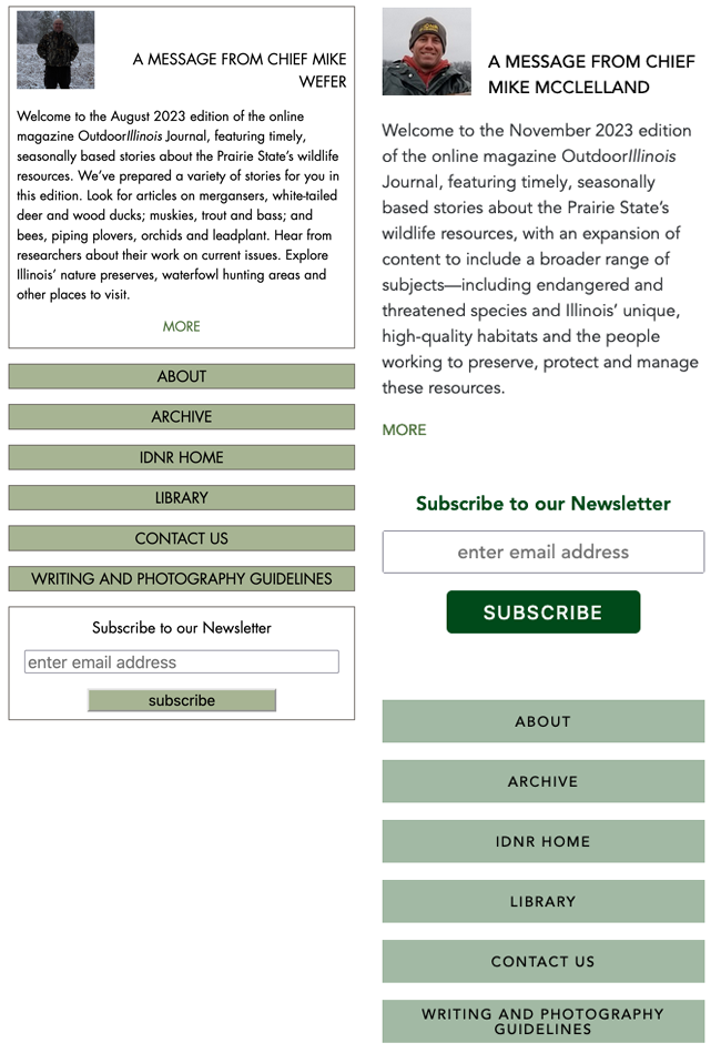
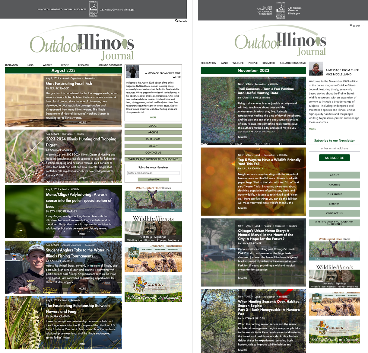
 When we recently upgraded Outdoor Illinois Journal to Nuxt 3, we took the opportunity to freshen up the site’s appearance, updating style details while preserving the basic design of the site. This was a chance to practice what we’ve learned from Gretchen Wieshuber, our Creative Director and Principal of Studio 2D. We challenged Aleksandra to spruce things up following our Design Guide for Programmers without explicit direction from Gretchen.
Here are a few of the changes, taken straight from the Design Guide.
The original site used Futura, a historic typeface from the Bauhaus era that we hold in high regard, but its strict geometric shapes and tall ascenders and descenders make it uncomfortable to read in extended text. Avenir, was designed by Adrian Frutiger in 1988 to be a more organic interpretation of the geometric style, more readable in a body of text.[1]
Our Design Guide says Do not outline shapes and Do not nest boxes. The original design had a lot of outlines (left). Notice how removing outlines noticeably cleans up the sidebar (right). You can also see how much more readable Avenir is in the text paragraph.
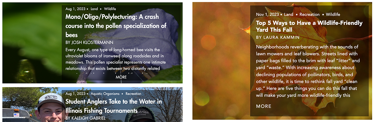
We made margins consistent and more comfortable, noticeable here in the article tiles (before on the left; after, right). Line heights and spacing between the text elements follow the rule of proximity—things that belong together should be closer and have consistent spacing between.
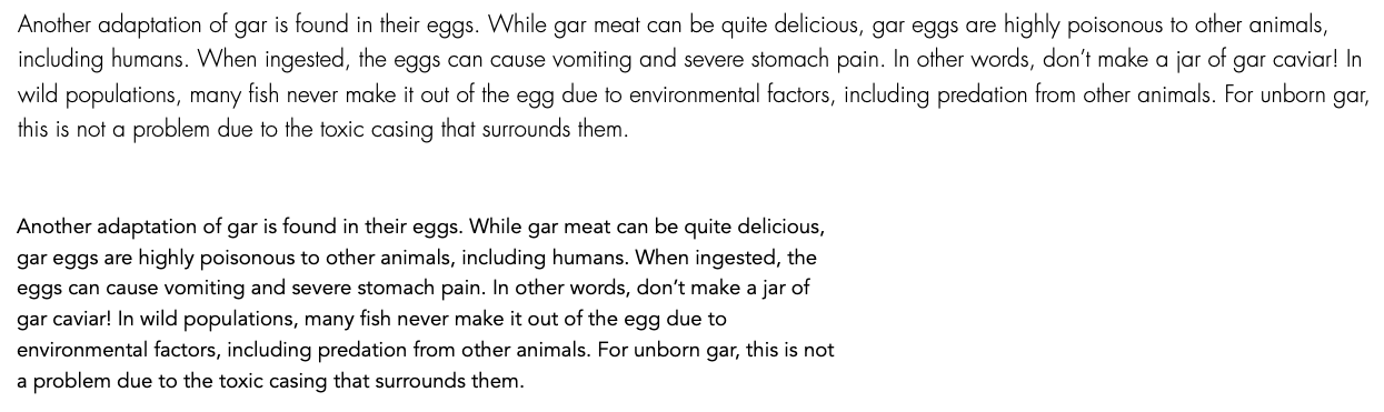
We limited the width of the content to keep everything in a comfortable viewing angle and to limit line lengths. The original site filled the entire viewport, which could cause lines as long as 142 characters. We like to keep lines to 90 characters at most.
Which is easier to read? Longer above; shorter below. Here you can see again the benefit of the Avenir typeface.
The old site had many different button styles that crept in over time across many different programming efforts. I especially wonder where we got the bevel buttons, reminding me of the 90s. (Yes, I remember web programming in the 90s.)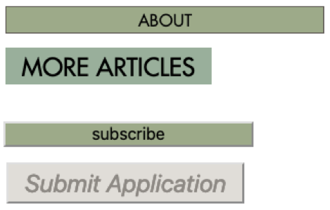
Now we have just two styles:

We think the improvement is subtle but effective. Here’s how it turned out! (before left; after right.)
For the past 10 years we have been working with a team of wildlife experts and communication specialists from the National Great Rivers Research and Education Center to build websites and tools for the Illinois Department of Natural Resources Wildlife Division. Outdoor Illinois Journal is one of the prize properties in the portfolio, a quarterly online magazine with hundreds of articles on a wide range of wildlife topics
Outdoor Illinois is built with the NuxtPress stack developed by 2wav, discussed by Matthew Hinton in an earlier blog post. We recently upgraded Outdoor Illinois to Nuxt 3—a major rewrite which yielded fantastic performance and technology improvements which is discussed in a companion article by Matthew.